Updated 2005-8/2.
This is a test of the animation style I wanted to pursue in The Light Princess,
particularly for the "conversation" interface. The idea is to create a range
of expressions and animation events that can be triggered from the conversation,
ambient conditions, and the character agents "emotion registers". For simple
"state-machine" characters these states can be triggered simply by event states,
but for emotive agents, they could be more subtle.
In any case, the redesign (simplification) of the engine in 2005 means that this
will be the principle 2D animation challenge of the game. We no longer have to
deal with characters changing angle and pose, just expression. This makes the
characters a lot simpler to animate (the price being simply that we have
to also do 3D character animation, but there are many resources for doing that).
Nothing has really changed about my goals here. I have decided that AutoManga
should become focused on this one problem, though, and I've gained the necessary
experience with Skencil scripting to get started on it.
Chancellor's Daughter
(This page may take awhile to load because of the animations)
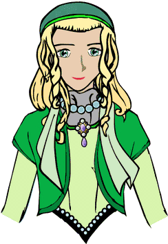
Animation Clean-Up and In-Betweening (January 2001)
After a long delay, I finally got back to cleaning up this
animation test:
It was a royal pain, due to a nearly complete
lack of automation -- which has got me really motivated to
writing an animation script/plugin for Sketch (Sketch, and
scripts for it are written in Python, which makes this a
fairly simple task).
Improvements you can see include:
- Manual "Cleaning" of Captured Curve Objects
- This involves using the "curve" tool in Sketch to smooth
over rough control points, delete unnecessary ones and add
new ones where needed. This sounds hard, but it's actually
not too bad. The hardest part is keeping track of all the
cels that have to be modified.
- Coloring
- This was done mainly by copying the outline objects and
deleting the "interior" curve. Then you squash it in a little
to insure it doesn't "peek" outside the lines. The colors
were matched by memory to Rosalyn's colors in her recent
Gimp comparison picture (February feature picture). I probably
didn't get it exactly right. Facial skin tone is extremely
finicky -- I spent a long time before settling on this color.
- Re-Drawing Eyes and Jewelry
- The eyes and jewelry are very finely drawn, so it is actually
easier to re-create them in Sketch than to use the traced curves
(the traced curves are useful as a guide to size, shape, and
placement, though). The jewels are also very geometric, so they
lend themselves to being drawn with circles and ellipses as well
as curves. Both objects have added highlights in this animation.
The jewels use a gradient fill effect, while the eyes where drawn
at higher resolution with manually added pupil and iris with
shadow and highlights. (I don't know what you call the radial
pattern in most people's irises, but I drew this as well, though
you probably can't tell as it's presently rendered).
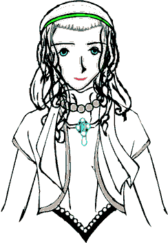
- In-Betweening with Blend Tool
- The Sketch blend tool has a few problems as an in-betweening
tool -- mainly that it requires a strict, one-to-one correspondence
between nodes. This means you usually cannot draw two independent
curves and then expect the blend to work smoothly.
I have some ideas about how to improve this, but for this test
I coped by adjusting the "base" curve to match the "animated"
position (instead of creating a new curve). This was actually
somewhat convenient, since the "animated" scan were really bad
for the locks of hair. I was unable to do this for the second
set of locks, which is why they are still rendered without
in-betweening. I tried out a "fade" effect on them, but it was
a disaster!
Right now, the in-betweened elements are: front locks (6),
eyebrows (2), scarf (4), and jewel (1) (i.e. the pendant jewel
on the ornament she's wearing at her neck). The numbers in
parentheses are the number of in-betweens I made for each. The
jewel in-betweens were created by doing a simple rotation about
the connection point, since it's supposed to be a rigid object.
So, what's left?
This is probably good enough animation for the game as is, but
I'm going to try two other things with it:
- Lip-Synch Positions
- Although the present "open"/"closed" mouth positions create
an impression that the character is talking, they were not meant
to be complete. I'm going to try using a more complete set of
mouth positions. The presentation engine design should allow
us to do correct lipsynching in whatever language the user selects,
using a simple messaging system between the "voice_line"
object (containing audio, text, and lipsynch data) and the
animation presentation object, so it's worth trying it out
For a quick introduction to this subject, you might want to look
at
Lip Sync -- Making Characters Speak by Michael Comet. This
article assumes you are animating 3D characters -- oddly I couldn't
find a 2D character lip-synch chart on the web (though I didn't
really look that hard).
- Shadow and Highlight
- Except for the eyes and the jewel, there's no shadow or
highlight in this image. This is typical of American TV
animation, but Japanese Anime, for example, usually uses a simple
three-tone approach -- each colored object has a base level,
a shadow level, and a highlight level. Obviously, on the computer
we have the option of using palette effects during animation, so
I'm going to work with that in mind. I think there's going to
be a fair jump in quality once these are added, and I don't think
it will be too painful to add them in Sketch (but I'll tell you
when I'm done :) ).
Animation Test Using AutoTrace and Sketch (November 2000)
First, here's the result:
The explanation of how I did it is below
Okay, I was pretty unhappy with my manual capture test (which
you can see below). But my previous experiences with autotracing
programs had not been very favorable, so I wasn't sure what
would work.
However, progress marches on, and it looks like the Free
AutoTrace
program is pretty good. My initial tests with running AutoTrace
on the original sketches were, however, complete failures. The
program doesn't cope well with the pencil or pen line drawings
as they stand.
I used a semi-traditional approach, in which I could take
advantage of the relative ease of hand-inking the pictures, and
still get vector output that was easier to handle on the computer.
For this first test I did little or no clean-up and coloring. For
production work, I expect to spend more time cleaning the drawings
up in Sketch, and I will be working on a cleaned up and colored
version of this test next. What I wanted to show was that I
could handle all the technical steps involved and produce a
somewhat pleasing result. Here's my procedure:
-
Load original in Gimp, print out multiple copies at a very
low density (about 40% or less). It would've been better, most
likely to use an ink jet and print in Cyan ink only, but I
only have a laser, so I just had to make it faint.
-
On these printouts, I used a permanent marker (a Sharpie (TM) )
to make nice, black inking over the components of the drawing
that I wanted to use in Sketch. I made fourteen separate inkings
for this project, using separate sheets to keep all the elements
separate. Some of these were also in "animated" positions, drawn
slightly shifted from the original drawing.
-
Then I scanned each of these fourteen sheets back into the computer
using a regular flatbed scanner.
-
With ImageMagick, I thresholded out the original drawing, leaving
only the inking. There's some finesse required here, and as I
mentioned above, it would probably be more efficient to use cyan
ink on the inking printouts. Then I could've color filtered the
input, using the cyan channel (or masking out the red channel),
so that the cyan image would disappear leaving only the black
inking). This might've required using Gimp rather than ImageMagick.
-
Once you have the inks, you run AutoTrace on the files to produce
Sketch output from them (it can also do SVG). These are pretty
clean when done this way.
-
Load each traced ink into Sketch. First, delete "fluff" -- AutoTrace
will often put in invisible or nearly invisible curves which just
add to the file size, but don't contribute to the drawing. Select
regions of the drawing, being careful not to select any whole object
that you want to keep (typically you'll see a bunch of curve points
spring up out of "nowhere"), and hit "delete". This usually produces no
visible impact on the image, but now you don't have all that fluff in
the way.
-
Now, explode the drawings -- save a separate copy of the file for each
element of the drawing that you want to edit separately. I divided
this drawing into 52 elements, including a few "animated positions"
of the same elements (hair, scarf, eyes, etc). Make a table of all the
available elements.
-
I wrote a short script, SketchMerge which uses tail, cat, and sed to merge Sketch
files. I used the table from the previous step to decide which elements
needed to be in which cels. I made a "lower hold cel", an "upper hold
cel" and various cels for face and mouth, eyes, eyebrows, and hair.
In principle, the idea is to put together the parts that will be animated
together.
-
Then I planned out the animation, using the cels I had (decided when to
blink the eyes, open the mouth, have the hair blow, etc). From this,
I wrote the script which makes each frame of the animation, using
SketchMerge to assemble the correct cels. No in-betweening was done on
this animation.
-
Running the script produces a long list of Sketch images, then converts them
to postscript, using the sk2ps program that comes with Sketch, then converted
to gif by ImageMagick, and lastly, combined into an optimized, animated gif
using GifSicle (I used the Debian 2.2 version).
As you can infer from the description above, I can now edit each of the
element files in Sketch to clean up the elements and add a color fill
objects to them. This is roughly analogous to the step of going from
"pencil-animations" to finished "cel-animations" in traditional cel
animation. I can also add highlights and shadows that way. The scripts
that I've already written will then take care of assembling all the
elements into an animation.
Another thing I can do to improve the output is to in-between the
frames. I'm thinking of trying out the curve blend tool in Sketch
for this -- it isn't designed for in-betweening, but it might work.
Otherwise, I should be able to add at least one manual in-between
for some of the elements. Some other areas need artistic work,
the lowered-chin is a little off from what it should be, and there
seems to be a small registration problem between the irises and
the eyelash line, but I'll work on those.
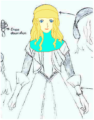
SVG Capture by Terry Hancock (September 2000)
I tried using Sketch (v0.6.4, from a Debian 2.2 Package) to
hand capture Katherine Chi's Chancellor's Daughter design into
an SVG vector graphic document.
This test took about one hour to accomplish, and there are noticeable
failings. I incorrectly interpreted the brow line as the hairline,
and so she has no eyebrows, but that's not that difficult to fix.
What remains is a large amount of clean up work to smooth out all
the lines. I haven't tried this yet, although with my present
skill level this could be quite time consuming indeed. I'd be really
interested to see the results of a proficient person doing it (any
volunteers?). Please if you do, make a note of how much time you
spend on it, as that's critical to determining practical contraints
on using SVG for animation (as has been proposed).
Here's my test picture: